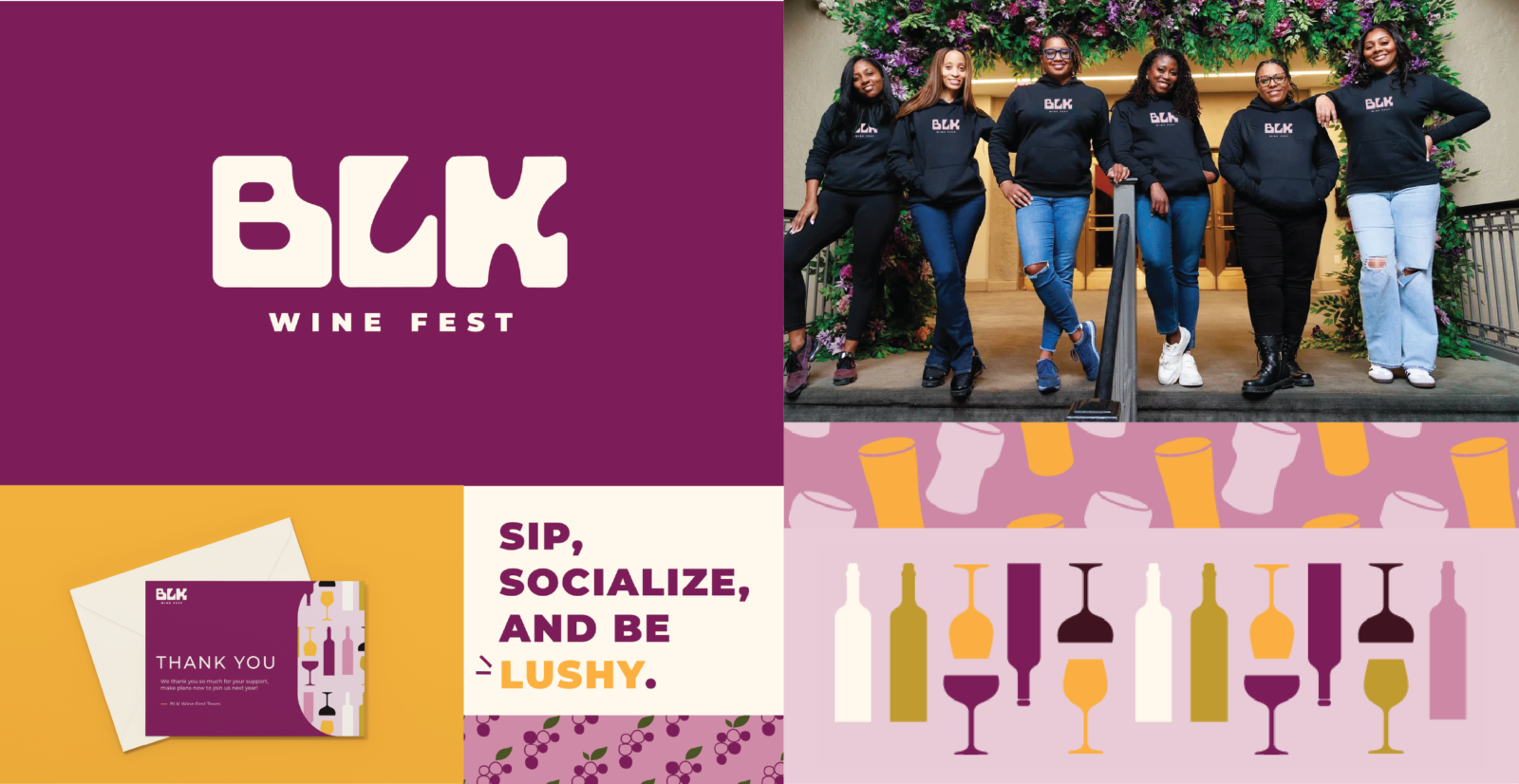
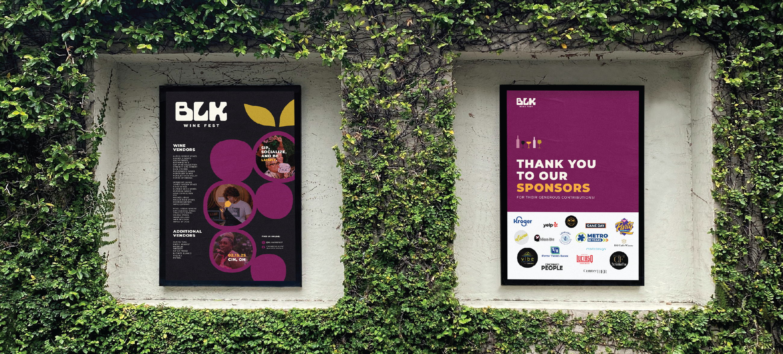
We began this rebrand where we always do - with a lot of research. We dug deep into the wine festival category, specifically seeking out other diverse wine events to see how competitors presented themselves and maintained their brand equity over years of hosting festivals.
And then we went beyond - taking inspiration from individual beverage brands, like Ghia Non-Alcoholic Apertif, House of Brown Wines, a black-owned and women-led wine label, and even Topo Chico, everyone’s fave mineral water/mixer/seltzer.
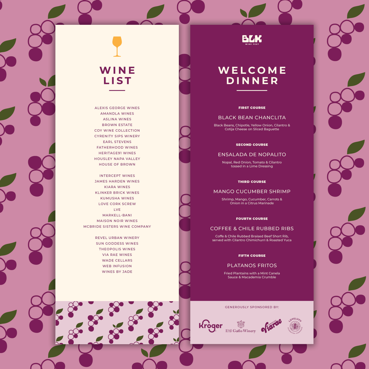
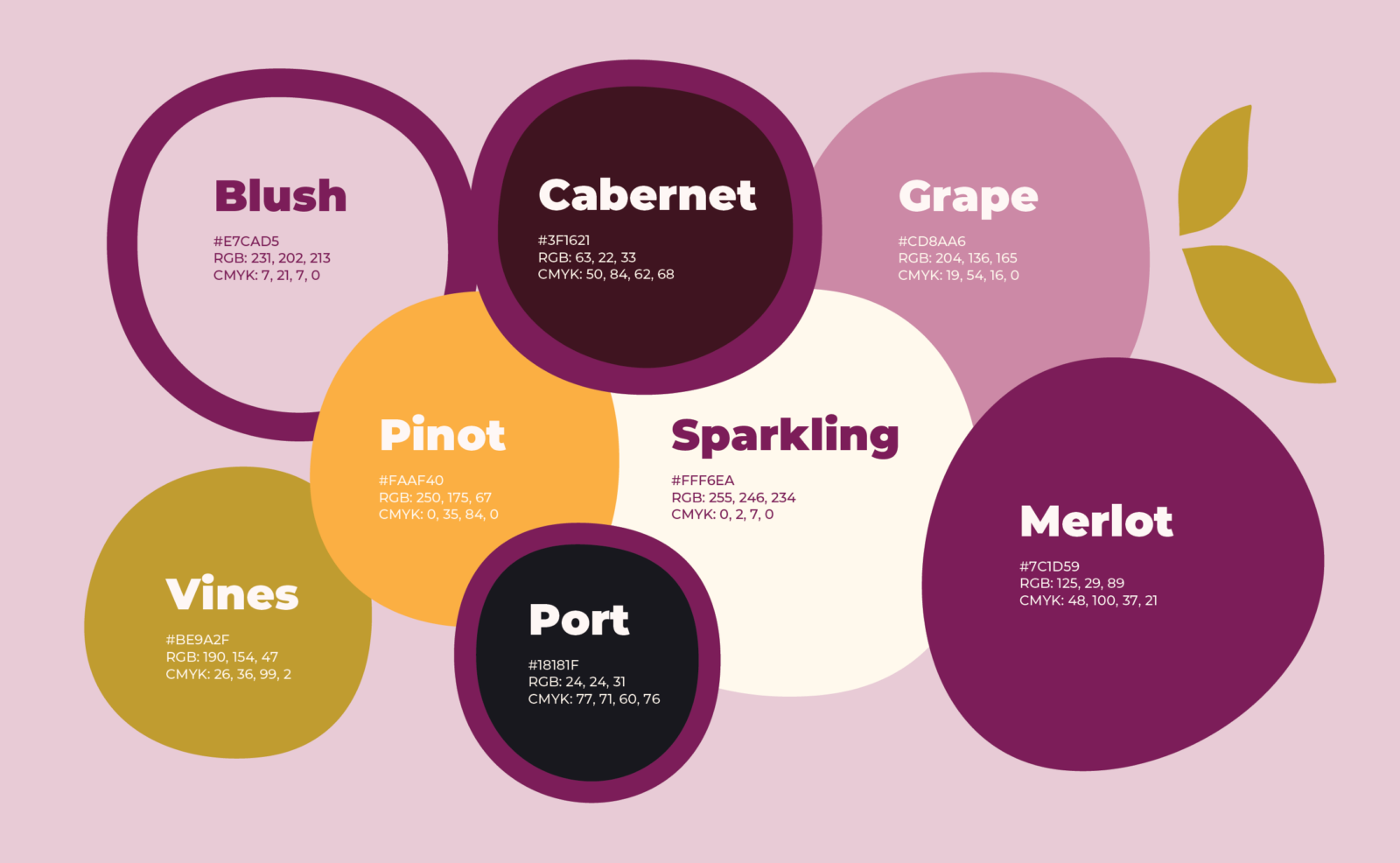
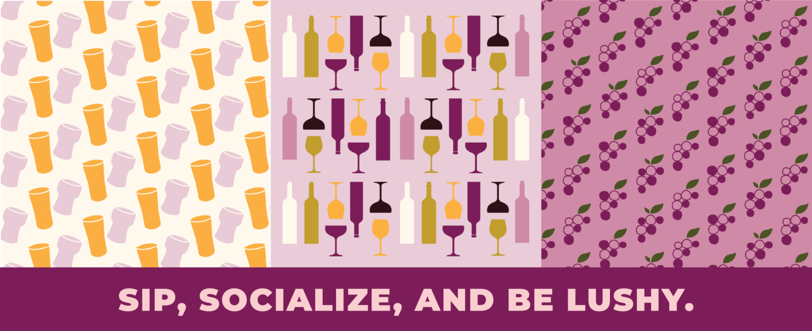
Through this deep cross-category evaluation, we were able to distill the unique design goals for BLK Wine fest - and deliver them in the final rebrand: A clean & ownable logo built with a customize typeface, a versatile wine-inspired color palette for any and all uses, and story-first brand built to grow with the festival.
