The Studio started the project working side-by-side with the client to develop a script that could be sized down or beefed up for future branded content.
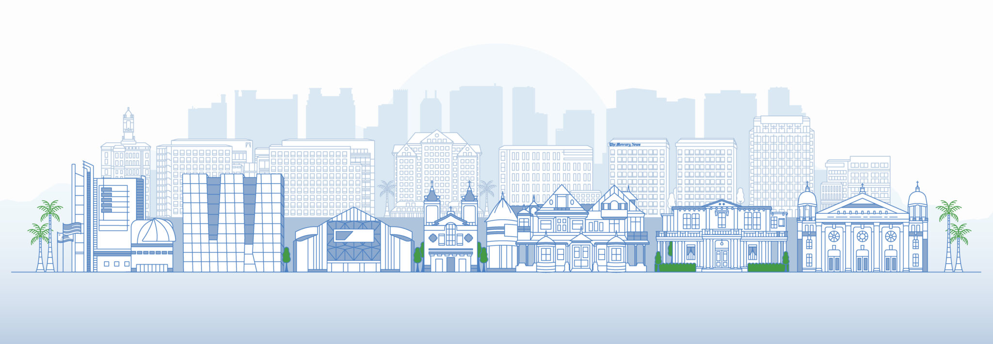
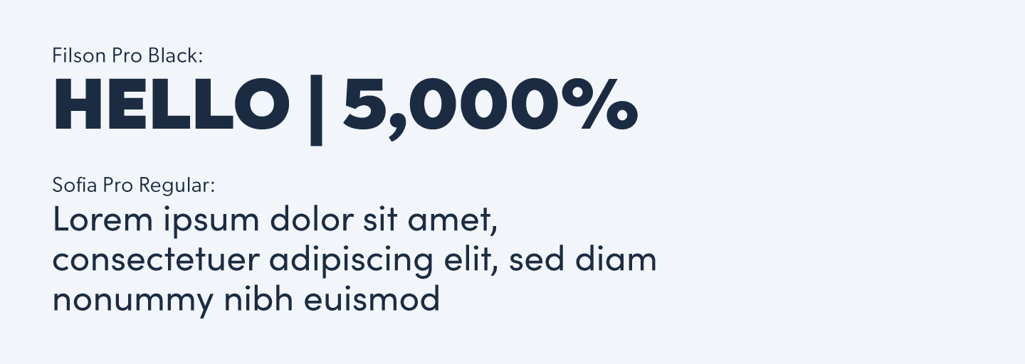
Once the script was in place, Mertz Design took B.A.N.G.’s brand guide and expanded on it, creating a sophisticated color palette and illustrating an entire digital environment for the brand to play in. Icons, characters, and an intricately artistic take on the San José skyline - complete with an Easter egg of the Mercury News building, a.k.a. B.A.N.G.’s flagship publication & headquarters.
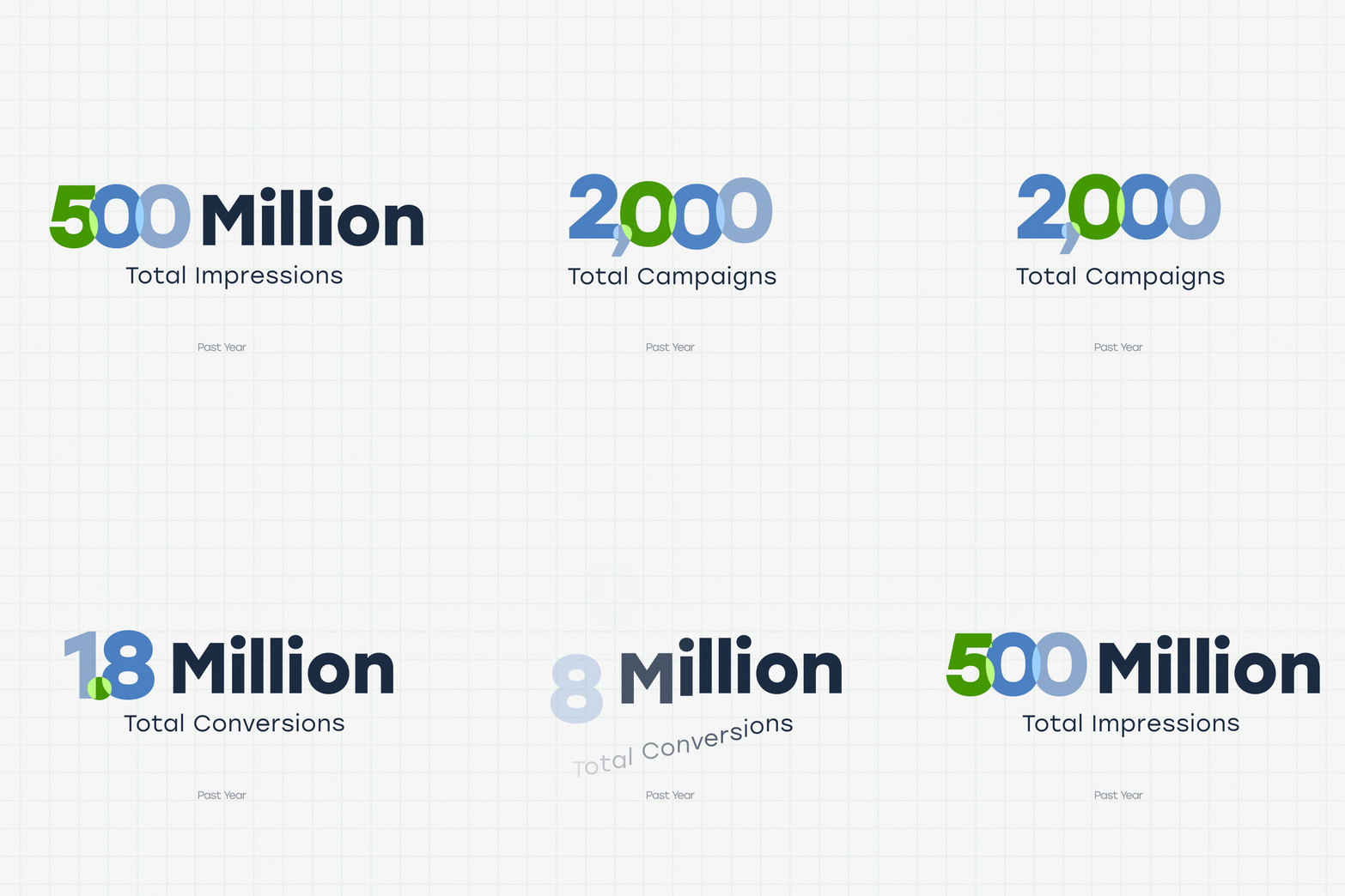
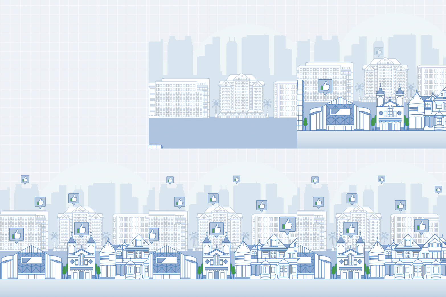
Everything on screen was designed to be flexible for the client, broken apart into individual illustrations and icons they could use on their website, or applied later to a longer, larger branded story down the line.


