The Power of Color: How to Use Color Psychology to Build a Standout Brand
The Power of Color: How to Use Color Psychology to Elevate Your Brand 🎨
Let’s talk color! 🎉 Sure, it might seem like just another visual element, but color goes way deeper than that. It’s not just about looking good (though, we all know that helps). For million-dollar brands, every color choice is intentional and strategic. They don’t pick their palette because it’s their favorite shade of blue—they pick it because they know exactly how it’ll make you feel.
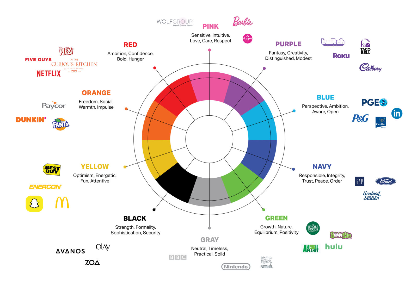
Let’s start with a little secret: The big brands we all know and love are infused with color psychology. Just take a glance at that chart above—notice how red dominates fast food? It’s no coincidence. Red is known to stimulate your appetite—so next time you're cruising down the highway and suddenly feel the need for a burger, blame it on those bold, red signs calling your name.

Color Psychology 101
Color psychology taps into how certain colors affect our emotions and decisions. It's about the vibe your brand gives off before a customer even reads a single word. Let’s break it down:
- Red: Passionate, urgent, and appetizing. It’s why you see it in fast food logos and sales ads. It grabs attention and stimulates action. But use it carefully—too much red can feel overwhelming.
- Blue: Calm, trustworthy, and reliable. That’s why you see it in banks and tech companies. Blue is great for brands that want to build trust and stability with their audience.
- Green: Health, growth, and nature. You’ll spot this color in wellness brands, eco-friendly products, and anything that wants to evoke feelings of renewal.
- Yellow: Happiness and optimism. Yellow is like a ray of sunshine on your brand, but go too far, and it can cause anxiety—so use it thoughtfully.
- Purple: Luxury, creativity, and wisdom. It’s perfect for brands that want to feel premium, a little mysterious, and thoughtful.
- Black: Sophisticated and powerful. It’s bold and used by high-end brands to create a sense of luxury and elegance.

How to Use Color to Build Your Brand’s Identity
Choosing the right color for your brand isn’t just about what looks good—it’s about what feels right. You want your audience to feel connected to your brand, and color is the first tool in your branding toolbox to do just that. Here’s how you can get started:
1. Define Your Brand's Core Values
Before picking colors, you need to get clear on what your brand stands for. Are you aiming for trust and reliability, or are you all about energy and excitement? Every color evokes a different emotion, so your brand’s core values should guide your decision. For example:
- Tech startups often go for blue to convey trust and reliability.
- Wellness brands lean into green to symbolize health and growth.
- Luxury brands tend to stick with black or purple to feel sophisticated and premium.
Actionable Tip: Write down three words that describe your brand (e.g., bold, friendly, professional). Then, match those emotions to colors that reflect that energy.
2. Think About Your Target Audience
Who are you trying to connect with? Different audiences respond to colors in unique ways. Younger audiences might prefer bright and bold, while an older, professional demographic may lean towards more muted tones. It’s about speaking to their subconscious with your color choices.
Actionable Tip: Conduct a little research on your audience. Are they more inclined to trust calming, professional tones (think: blues and greys), or do they want something lively and playful (think: oranges and yellows)?
3. Consider Cultural Context
Here's where it gets even trickier: International markets. What looks great and feels right in one country might have a completely different meaning in another. For example, red in China symbolizes good fortune and joy, but in some other cultures, it could signify danger. Don’t get caught making the wrong impression!
Actionable Tip: If your brand has plans to go global, research how your color choices are perceived in different cultures. It’s a crucial step in avoiding potential brand missteps.
4. Test, Test, Test
Before committing to a full-on rebrand or redesign, test your color choices. Create mockups of your logo, website, or social media posts in different color schemes. Then, test them with your audience. Sometimes what looks great on paper doesn’t always translate to real-life applications.
Actionable Tip: Use A/B testing on social media or email campaigns to see which colors resonate most with your audience. This will give you data-driven insights on how different color schemes affect engagement.
Bringing it All Together: THINK First
At Mertz Design Studio, we always say it goes back to THINK. Once you’ve nailed your brand strategy and values, color plays a huge role in bringing those feelings to life. It's not just about looking pretty; it's about making a statement—communicating who you are with one glance.
So, the next time you're working on your brand, ask yourself: What do I want my audience to feel? From there, use color as your secret weapon to build the brand of your dreams. 🎨💥
Want some help picking the perfect palette for your brand? We’ve got you covered. Head over to mertzdesignstudio.com, and let’s bring your brand to life in full color!


