Brand Guidelines: Seriously, you need them
Brand Guidelines: The Rules Every Business Needs to Play By 🎯
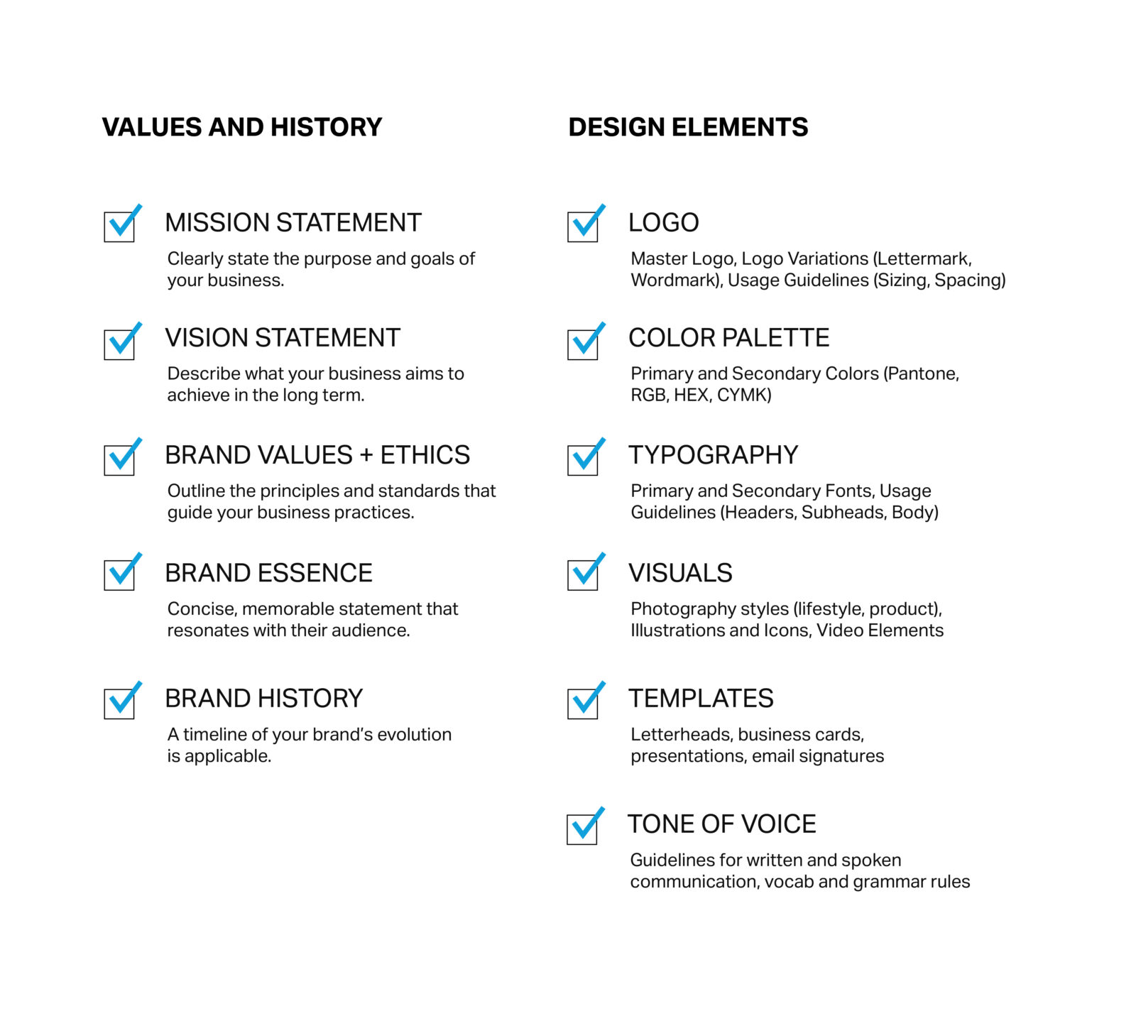
Let’s talk brand guidelines—those all-important rules that define who you are and how your brand shows up, no matter where it goes. Think of your brand like a person: consistent in the way they talk, dress, and act. Well, that consistency doesn’t just happen—it’s guided by well-crafted brand guidelines.
For small businesses, having a set of brand guidelines is essential. You might not have a multi-million-dollar marketing budget, but your brand can still look like it does. Why? Because consistency = credibility. And guess what? Credibility builds trust. A polished, consistent brand presence makes you look like you have it together, even if you’re still figuring things out behind the scenes (no judgment here).
So let’s dive into why brand guidelines matter and exactly what you need to include.
Why Brand Guidelines Matter 🎨
Imagine you’re designing a website, sending out an email blast, or even printing business cards. What happens if every piece of communication looks a little different? Your audience gets confused, and confusion leads to mistrust. No bueno.
Brand guidelines keep everything cohesive, making sure your logo, colors, fonts, and even tone of voice are all singing from the same song sheet. Consistency across the board is what makes your brand recognizable and reliable, from your Instagram feed to your email signature.
In other words, guidelines aren’t there to limit creativity—they’re there to help you shine. When your brand shows up looking flawless everywhere, it strengthens your message and makes your business memorable.
What to Include in Your Brand Guidelines 📑
Now that you know why they matter, let’s break down the essentials every brand guideline document should include:
1. Logo Usage
Your logo is the face of your brand, so it deserves to be treated with care. Your brand guidelines should outline:
- Primary and secondary logo usage: When should you use the main logo, and when is the secondary one more appropriate?
- Placement rules: Define where the logo should be placed on different materials.
- Clear space: Specify the white space around your logo to ensure it doesn’t get crowded.
- Minimum size: Set the smallest size your logo can be displayed without losing its integrity.
💡 Pro Tip: Make sure you include both color and black-and-white versions of your logo for different applications.
2. Color Palette
Consistency in color is a big deal for brand recognition. Coca-Cola wouldn’t be Coca-Cola without its iconic red, right? Define:
- Primary colors: These are your go-to brand colors, used in all key branding materials.
- Secondary colors: Additional colors that complement your primary palette.
- Hex codes, RGB, and CMYK: Include the exact color codes to make sure your colors are always right, whether they’re online or in print.
3. Typography
Fonts are more than just pretty letters—they tell your brand’s story. Make sure your brand guidelines specify:
- Primary font: The main font used for headings, logos, or important messaging.
- Secondary font: A complementary font used for body text or supporting materials.
- Font sizes and hierarchy: Define which sizes should be used for headings, subheadings, and body text to create a clean and organized look.
4. Tone of Voice
Your brand’s personality shines through in how you talk to your audience. Is your brand friendly and approachable? Or formal and professional? Make sure your guidelines cover:
- Tone: Outline the general tone your brand uses (e.g., casual, professional, cheeky).
- Key phrases: Any signature phrases, slogans, or taglines that should be used consistently.
- Dos and Don’ts: What language fits your brand—and what doesn’t?
5. Imagery Style
Images say as much about your brand as words do. Define what types of photos, illustrations, and graphics fit your brand identity, such as:
- Photography style: Bright and vibrant? Soft and muted? Make it clear!
- Image guidelines: What types of images work for your brand and what doesn’t (e.g., no stock photos or overly posed shots).
6. Icons and Graphics
If your brand uses custom icons or graphics, make sure to set rules on their style and application. Consistency in these small details can elevate your brand’s visual identity.

How Brand Guidelines Help You Stand Out 🌟
When you have clear brand guidelines, it’s like handing over a rulebook to anyone who touches your brand. Whether it’s a new hire, a freelance designer, or a printing partner, they all know exactly how to represent your brand, even when you’re not in the room. No more guessing or creative liberties—they’ve got the exact tools they need to keep things consistent.
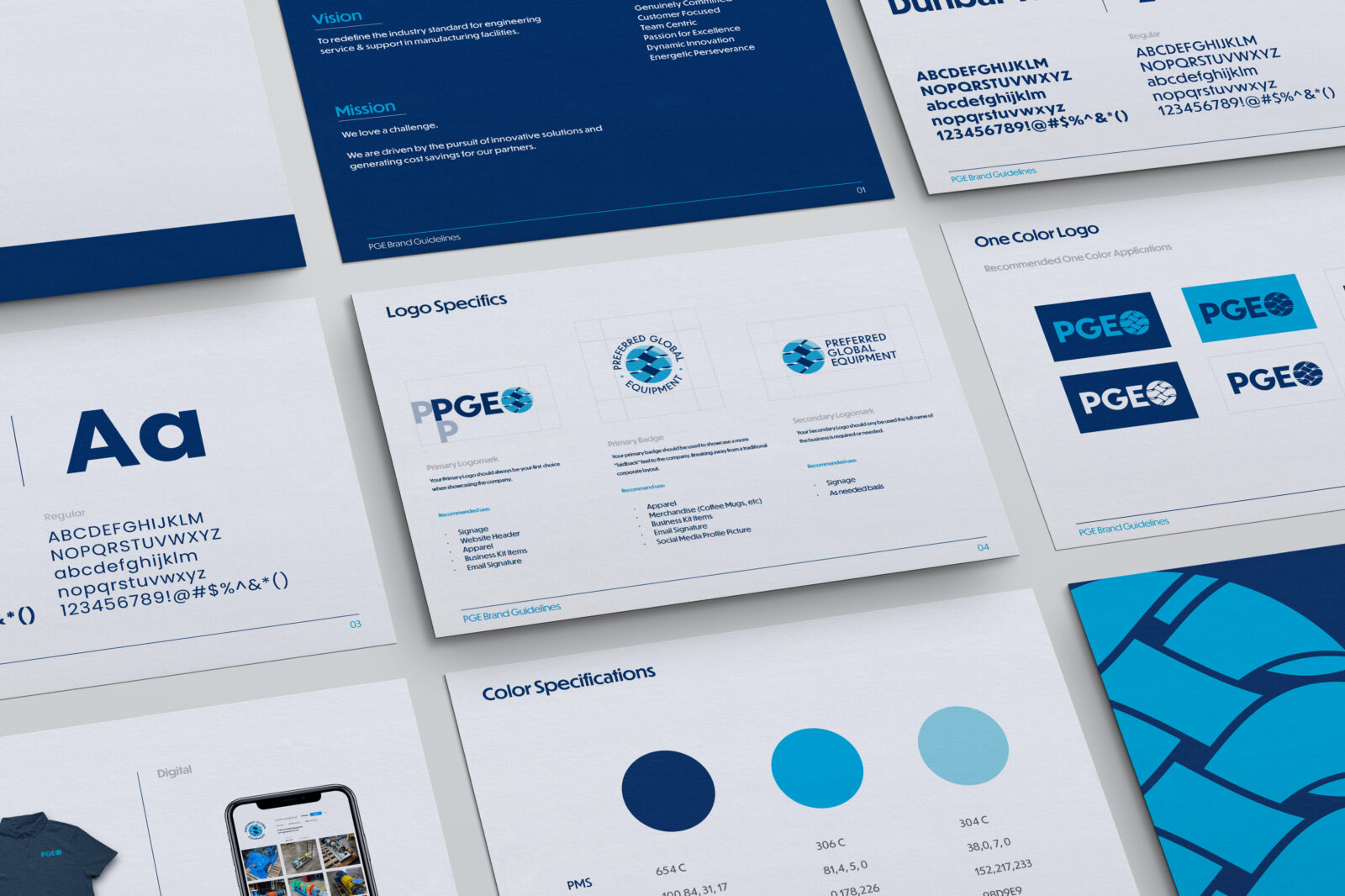
For instance, PGE (Preferred Global Equipment) has detailed guidelines on logo usage, color palettes, and typography. These guidelines define everything from the white space around the logo to the minimum size the logo should appear, ensuring it always looks its best, no matter where it’s displayed. https://pgequipment.net/

Final Thoughts
Brand guidelines aren’t just for big corporations. They’re for every business that wants to look sharp, professional, and consistent across the board. By defining these key elements—logos, colors, typography, tone, and more—you’re setting the rules of the game and ensuring that your brand shows up in the best light every single time.
So, what are you waiting for? Let’s get those brand guidelines in check and watch your business thrive. Visit mertzdesignstudio.com to see how we can help bring your brand vision to life!


