iFixit
ifixit
A Magnetic Mat to Organize All of Your Bits And Pieces
think.
Ideation
Concept Development
make.
Product Design
Package Structure
3D Visualization
2D Visualization
evaluating tray structure
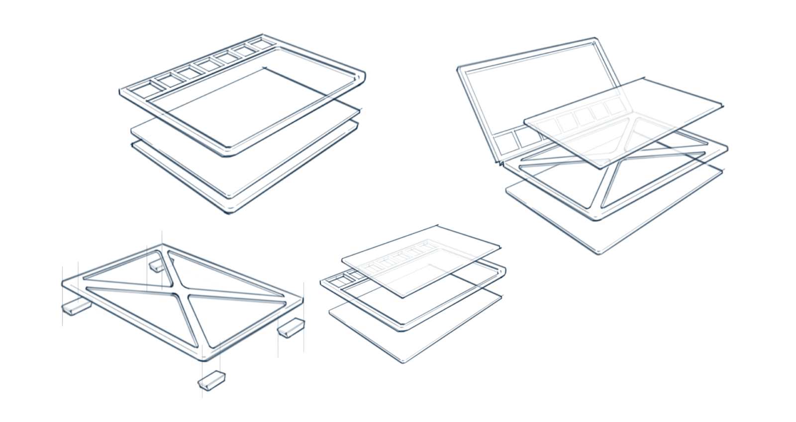
The team explored multiple ways to solve for stack-ability and tray stiffness. It was critical that the tray did not flex while transporting which could lead to pieces falling off.
tray layout EXPLORATION
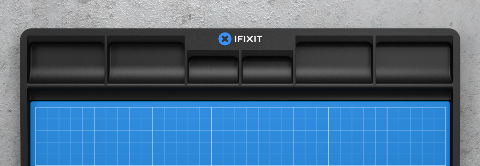
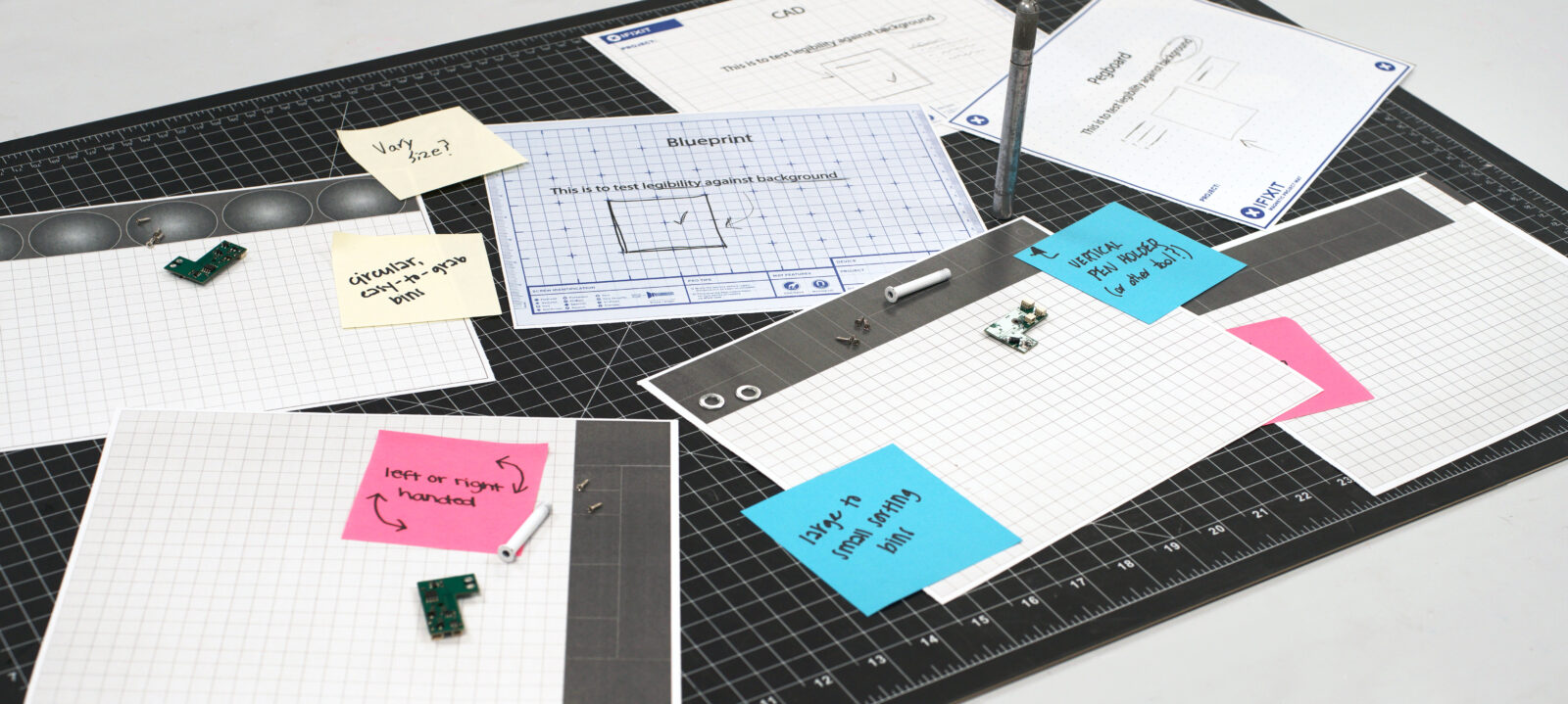
Our team iterated on multiple pocket placements, taking into account what would work for both left and right handed users while writing on the pad.
mat artwork design
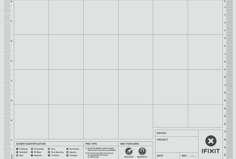
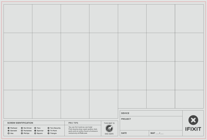
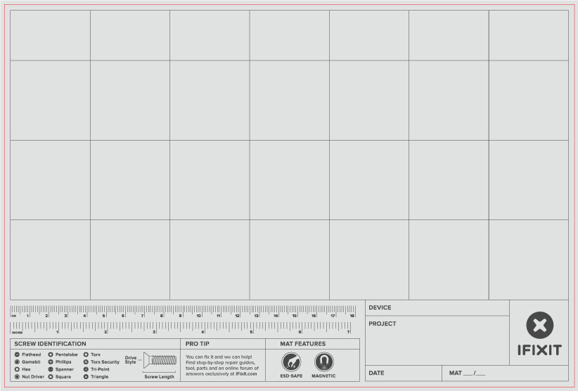
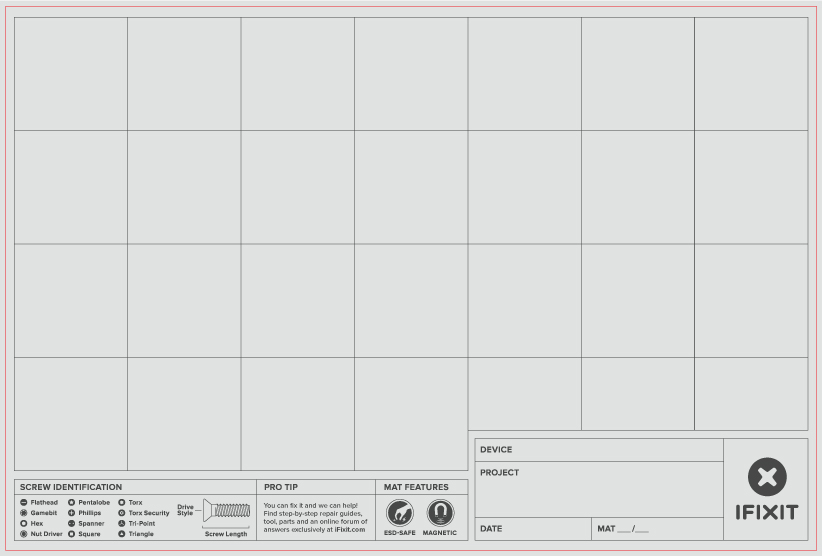
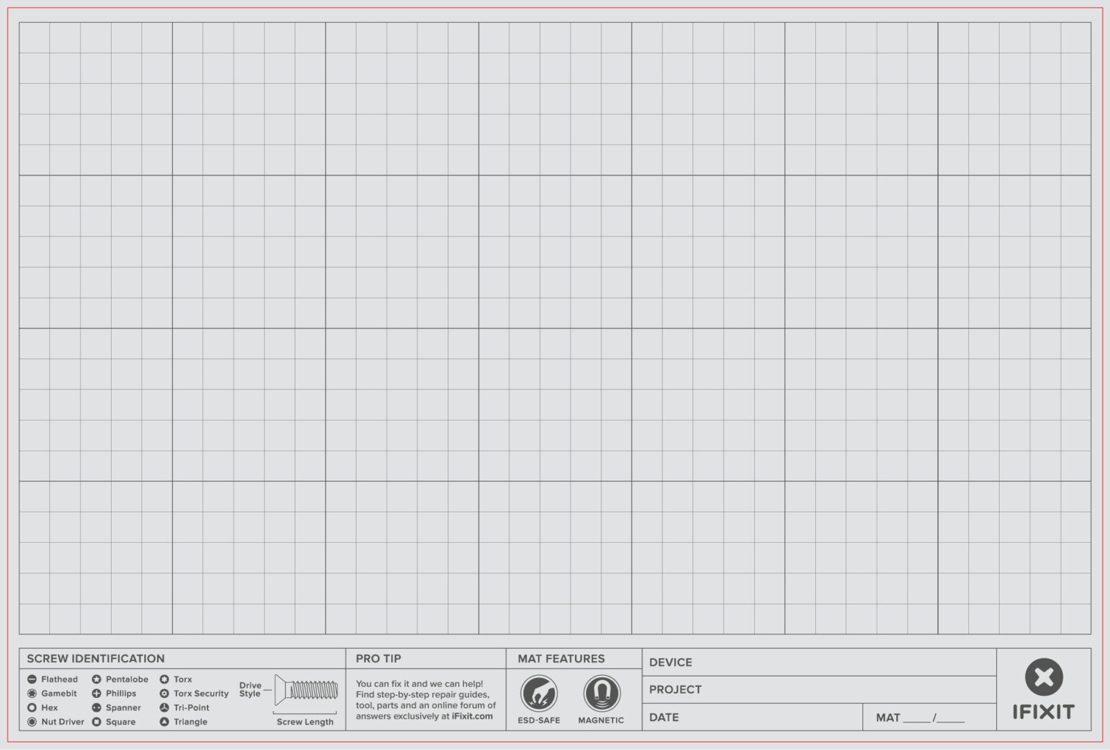
Our team evaluated multiple graphic layouts for the magnetic pad. It was important to allow enough room for part sorting and cataloguing while still providing and ID chart and title block at the bottom.
